App Enhancement
The goal of this project was to modernize the app’s design, improving both visual appeal and user experience while boosting functionality to increase user satisfaction and drive business growth. The redesign aimed to elevate the quality of the app, preserving its core essence that users love and use continuously.
This UX case study highlights my process and contributions to the redesign of the fitness app, focusing on user experience, efficient problem-solving, and data-driven decision-making.
About client
ABC Trainerize is fit tech company that provides software for any fitness business, of any size, anywhere in the world. With 400k+ personal trainers and coaches, 45k+ health and fitness businesses, 16M+ clients to build their own vision of fitness and bring it to life, every day through product.
How we started and Main Challenge
Net Promoter Score (NPS) had fallen, signalling a notable decline in user satisfaction.
The drop suggested potential disengagement and increased churn risk, prompting further investigation to identify pain points and prioritize design improvements to enhance user experience and retention.
Data-driven insights
To guide our redesign decisions, we conducted extensive user research through surveys and engagement data analysis, collaborating with the data analytics and marketing teams.
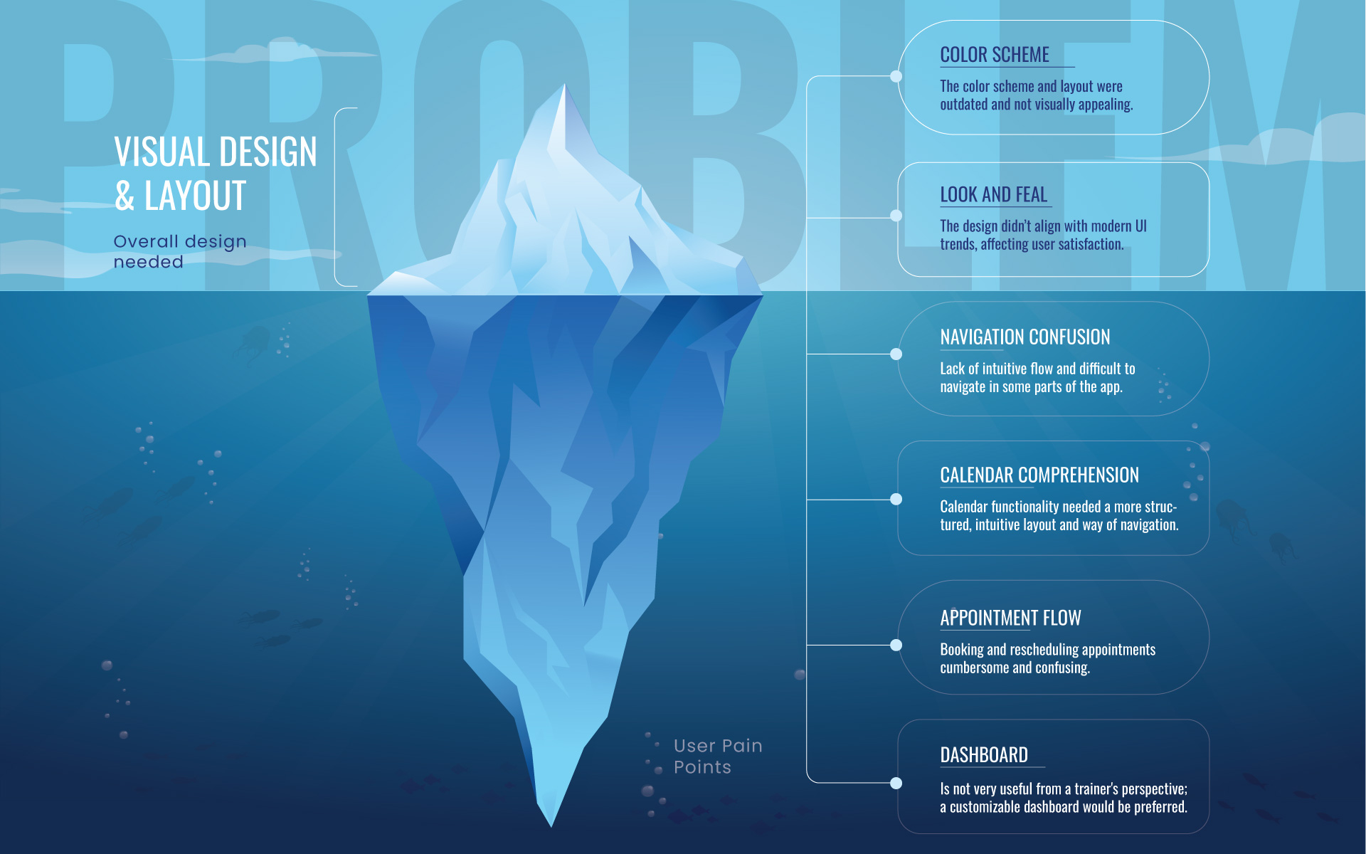
Survey
From a visual and user experience standpoint, the color scheme and layout required the most improvement to enhance the overall look and feel. The dashboard, client management, and progress graphs were identified as the other two key areas that needed significant attention.
We have identified the following Problems
Research
User Interviews
I dove deep into user interviews to truly understand the psychology, motivation, and specific needs of the app’s users. My goal was to get to the heart of the problems they were facing—what was making them frustrated, what features they were struggling with, and how they were using the app in their day-to-day routines.
Competitive Analysis
Identifying and analyzing competitors’ apps, researching their different strategies to understand their strengths and weaknesses in relation to our own. How do they solve a certain problem, also what are the functionalities they have that we lack and vice versa.
Solution
Visual Design and User Experience:
Color scheme, layout, and overall design needed a modern update to enhance visual appeal.
Dashboard and Client Management:
Dashboard and client management features were cluttered and difficult to navigate, requiring a more intuitive design. Dashboard is not very useful from a trainer's perspective; a customizable dashboard would be preferred.
Appointment Booking Flow:
Users, particularly clients booking appointments with trainers, often experienced frustration with unclear flow, leading to a prolonged booking process.
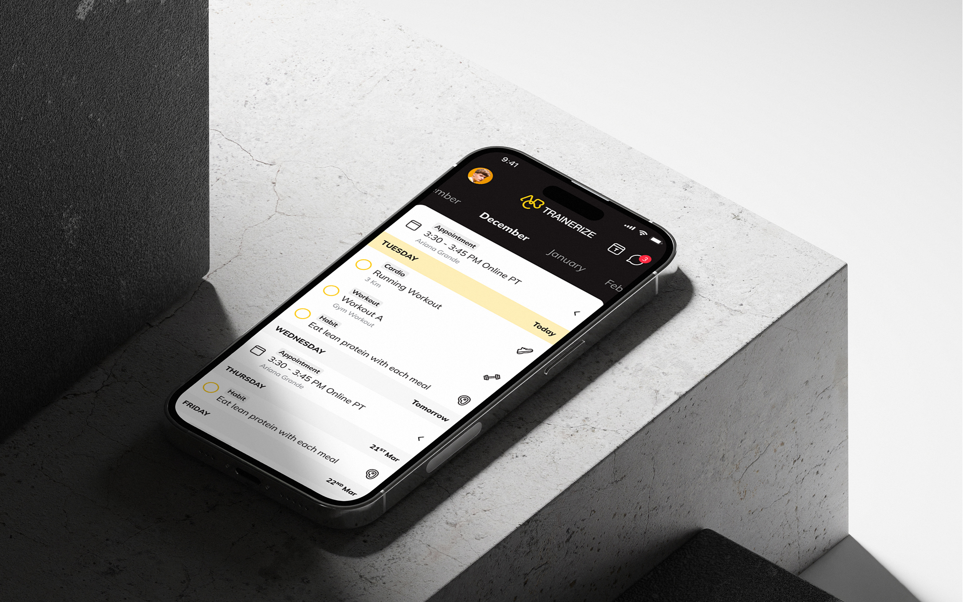
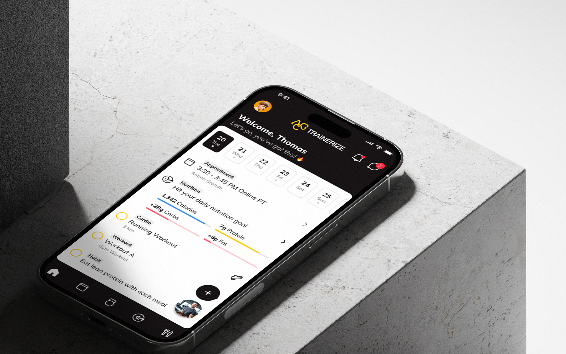
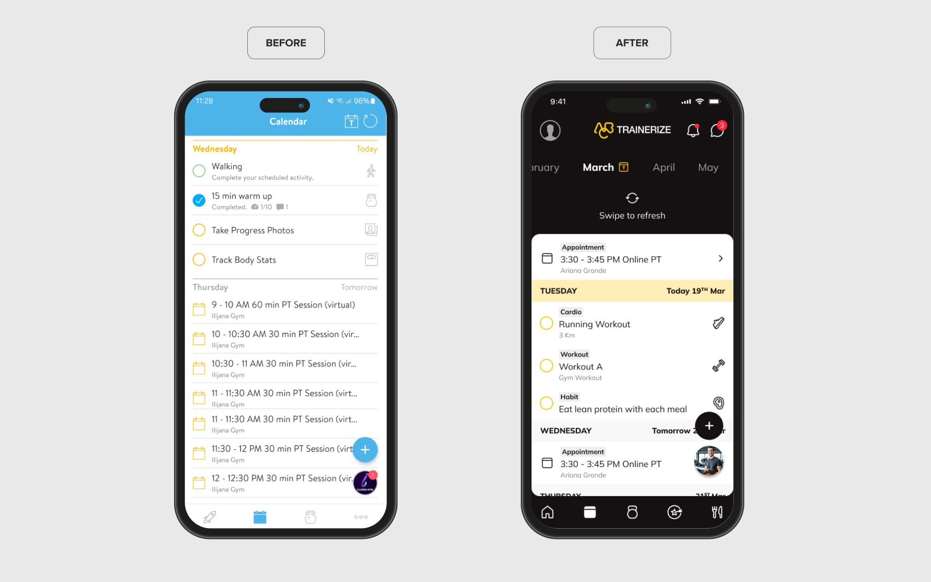
Calendar
Initial Problem:
Current calendar functionality was cluttered and confusing, with overlapping features for workouts, meals, cardio, and appointments, leading to a poor user experience.
Design Solution:
I created several concepts to simplify and clarify the calendar's purpose. The new design consolidates everything into a clear, single interface, maintaining easy access to all features but with improved structure and flow.
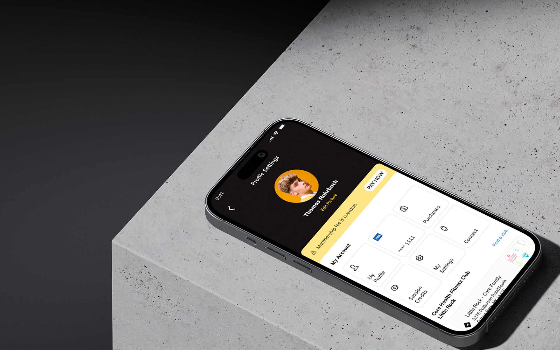
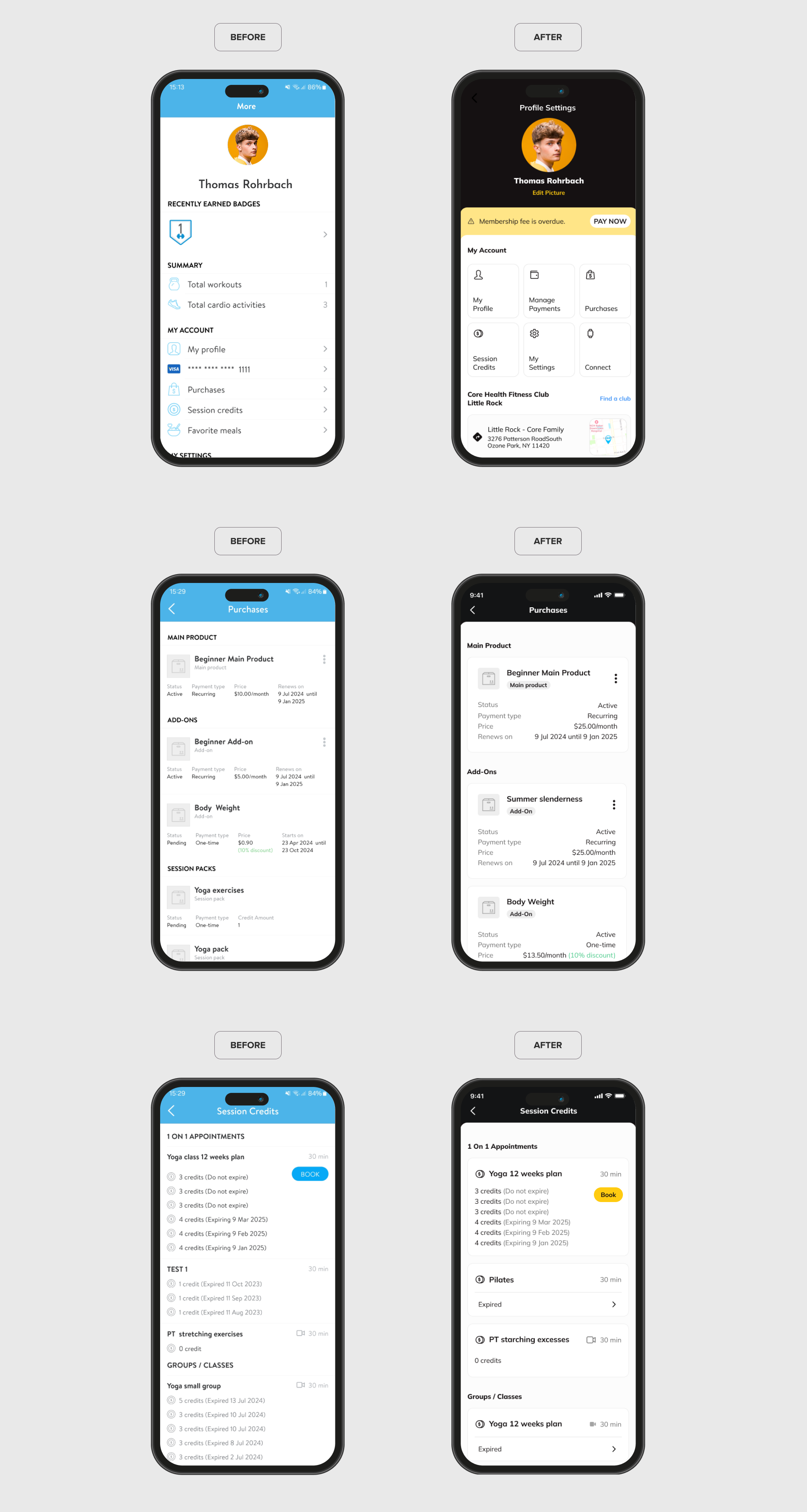
Profile Section
Initial Problem:
Profile section was cluttered, with disorganized information, making it difficult for users to access and interpret their data quickly.
Design Solution:
Simplifying the layout by using cards to organize key information such as profile settings, purchases, and payments. Profile information is now accessed through the profile image, following a more conventional navigation pattern.
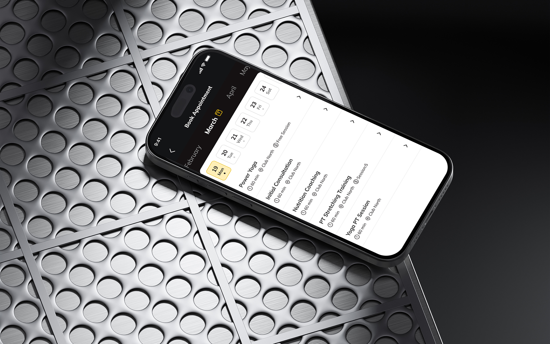
Appointment Flow Rebuild
Initial Problem:
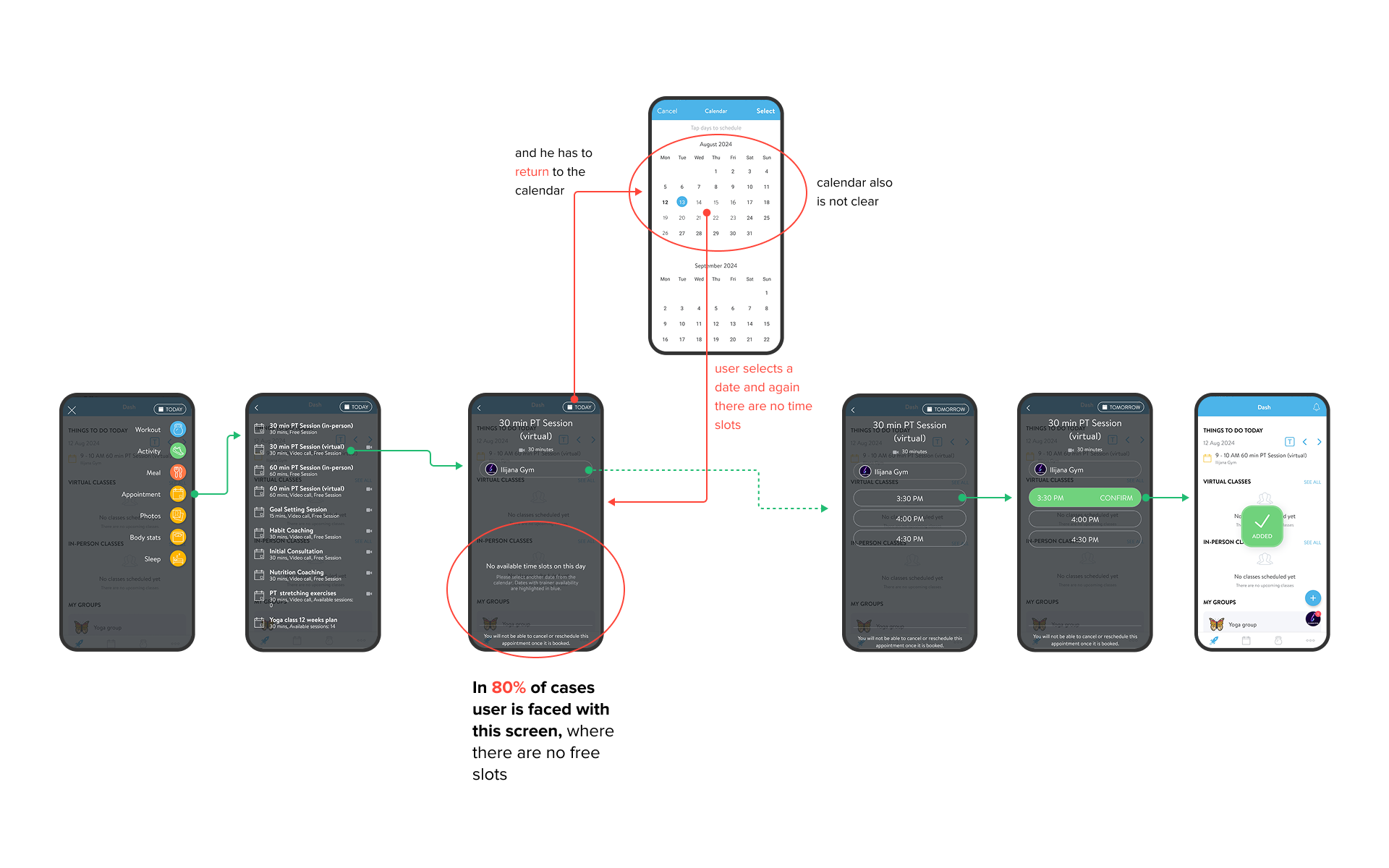
Design Solution:
Implementing a slider that filtered out unavailable appointment by time slots, I created a smoother and more efficient booking process. For the selected date, only appointments that have a free interval will appear, This change shortened process and removed unnecessary steps, enhancing clarity and reducing friction for both clients and trainers.
Challenges Faced
Balancing user needs with business objectives
The challenge was ensuring that the redesign met both the functional requirements of the users and the business goals of the company.
Implementing complex changes without disrupting the current app’s functionality
Had to carefully integrate new features while maintaining a seamless experience for existing users. looking for a middle value that satisfies all parties and work closely with development, is what contributed to the success.
Reflection
The research-driven approach allowed us to make informed decisions that significantly improved the app without losing the core value it provided.
I learned the significance of clear user flows, especially for time-sensitive tasks like booking, and the value of planning, the importance of data-supported research and collaboration with cross-functional teams to align design decisions with business objectives.